#16: All about dat font

Typography and the use of lettersets and fonts was the preserve of (mostly) men working in the printing industry, until the invention of the laser printer alongside DTP and word processing software brought to the masses that ability to have 20 different fonts in all the sizes you like in a single document.

Historically, using lots of fonts, sizes and weights might have been a way of attracting attention – look at the 1843 poster which was the inspiration for John Lennon to write “Being for the Benefit of Mr Kite” as one example …

Mr_Kite_-_Full_Color_Photo (Custom) (1)

… but these days, simplicity and consistency is generally preferred.

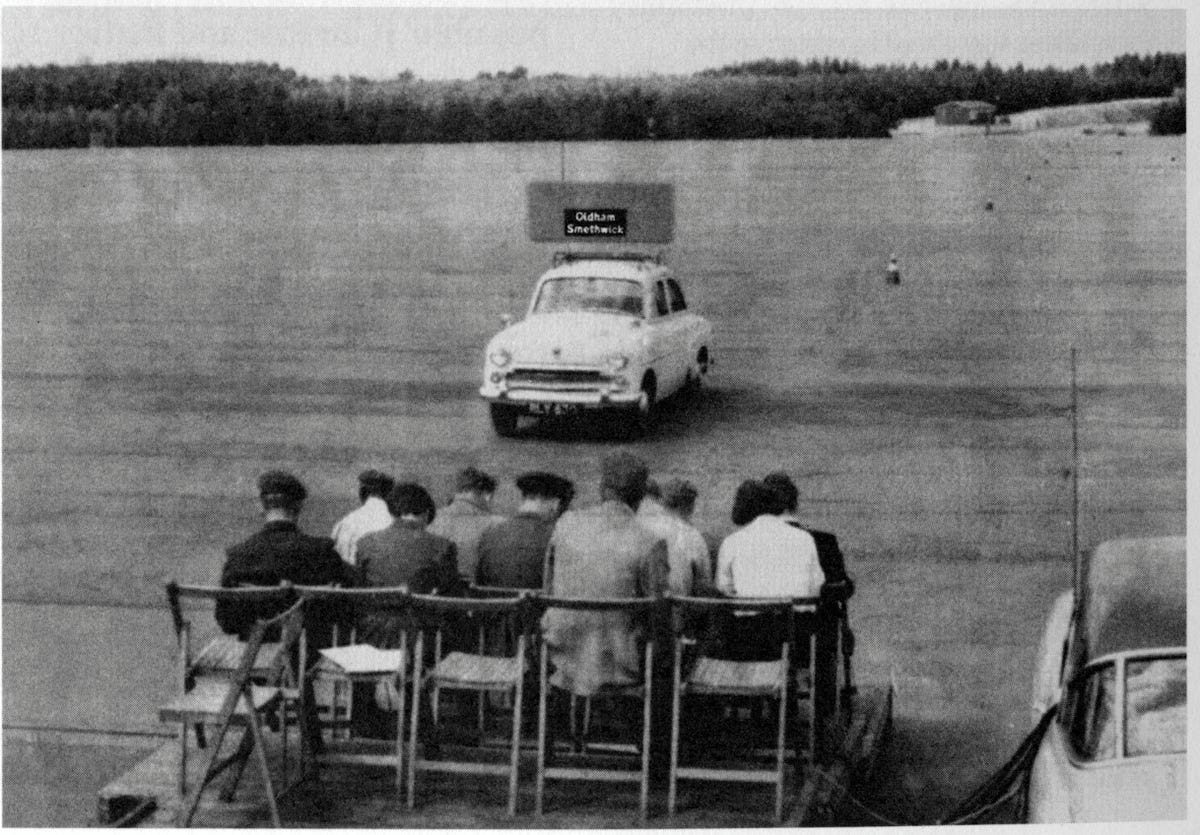
For a fascinating diversion into modern history, check out Jock Kinnear and Margaret Calvert’s seminal work on the UK’s motorway signage. Most people wouldn’t give it a second thought, but carefully designing the font and the layout of the signs to be employed in the late 1950s was a central part of the rollout of the new motorway network.

To test how legible signs might be at speed, an assembled group of volunteers sat on a platform at RAF Benson airfield while sample signs were driven past on the roof of a car. The thinking was that if you’re travelling as fast as 60mph, you won’t have time to read the words on a sign, instead relying on their shape – so the consistency of capitalization, the tail of the g and the stem of the h in Birmingham become second nature to the driver.

clip_image004

For more font-related history, check out Simon Garfield’s surprisingly engaging Just My Type.

Back to the present

Typeface trends tend to be a dating mechanism; Times New Roman looks very mid-1990s, whereas cool kids would use a sans serif default like Arial. Microsoft switched to using the newly designed Calibri for Office 2007, moving from a default font whose primary purpose was to look good in print to one which was specifically designed to be readable on screen. Similarly, the Segoe font family took a leading role as the default font for Microsoft logos and in the UI of many apps.

Incidentally, if you want to try a font out to see how it looks in a large block of text, you can enter =lorem(nnn) onto a new line in Word, and it will generate nnn paragraphs of the ‘lorem ipsum’ cod Latin gobbledygook to fill your pages up. Or you could go to Copilot or ChatGPT and ask it to write a 1,000 word essay for you

Well, Calibri’s default-ness has been under threat for a few years – Microsoft announced its intent to switch and outlined several new fonts which might be the default. Last year, it announced the decision to switch Calibri to a newly-named font called Aptos, previously known as Bierstadt.

clip_image006

After a period of testing for preview customers, the switch has now been flicked and M365 users will see Aptos as their default. Cue some amusing anthropomorphism of the fonts’ particular characters and histrionic headlines from the usual clickbait foundries.

clip_image008

578 – Let’s talk about fonts

clip_image002Most people don’t really think too much about which font they’re using in written works. The novelty of having different font designs, weights and sizes soon wears off, especially if you like to try all of them in the same document.

clip_image004Some strange choices do persist, though – Comic Sans on a warning sign at an electricity substation?

Yet, there is a lot of thought which goes into creating a font, especially when considering how it’s likely to be used. Typeface design goes back to the earliest days of printing, with fashions changing from heavy and elaborate block type to lighter and perhaps easier to read lettering. To serif or to sans?

The author Simon Garfield has written extensively on the subject of typography, including articles on What’s so wrong with Comic Sans? or The 8 Worst Fonts In The World and his really excellent book, Just My Type, which delves into the history behind lots of common typefaces and how or why they came about. It really is fascinating.

Even the design of the text used on road signs was a hot topic in the 1950s, with the UK facing a need to choose a standard for the upcoming motorway network, which could be easily read at speed. Designers Jock Kinneir and Margaret Calvert came up with many road signs and the typeface design still used today (theorising that at 70mph, a driver looking for Birmingham won’t actually read the letters, but will recognise the shape of the word). Trials were done by fixing words to the top of a Ford Anglia and driving it past a group of seated, bemused volunteers, to test the fonts’ efficacy.

A lot of technology we take for granted today has its roots in the 1970s at Xerox’s PARC research establishment or was materially advanced there – ethernet, bitmapped displays, laser printers, the mouse, the GUI, object orientation, distributed computing and so much more – and the two founders of Adobe, who went on to define PostScript, started their work together there. This font-rendering software – along with the Apple Macintosh & LaserWriter and the Desktop Publishing software PageMaker – laid the way to revolutionise the printing industry.

clip_image006Most fonts used until the 21st century had been designed to look good in print, but 14 years ago, Microsoft shipped a new font in Office 2007 and Windows Vista. Designed specifically to be easy to read on-screen, presuming that most documents and emails will be read on a display rather than printed out, that font was Calibri. It became the default font used in Office applications and has remained so since.

But that’s all about to end.

clip_image008

Cloud Fonts” are available to Microsoft 365 subscribers (more info here) – in Word, go to File / Account and look for the optional settings.

Five of the Cloud Fonts collection are being considered to be the new default font for Office apps in the future… which would you choose?

fonts