Typography and the use of lettersets and fonts was the preserve of (mostly) men working in the printing industry, until the invention of the laser printer alongside DTP and word processing software brought to the masses that ability to have 20 different fonts in all the sizes you like in a single document.
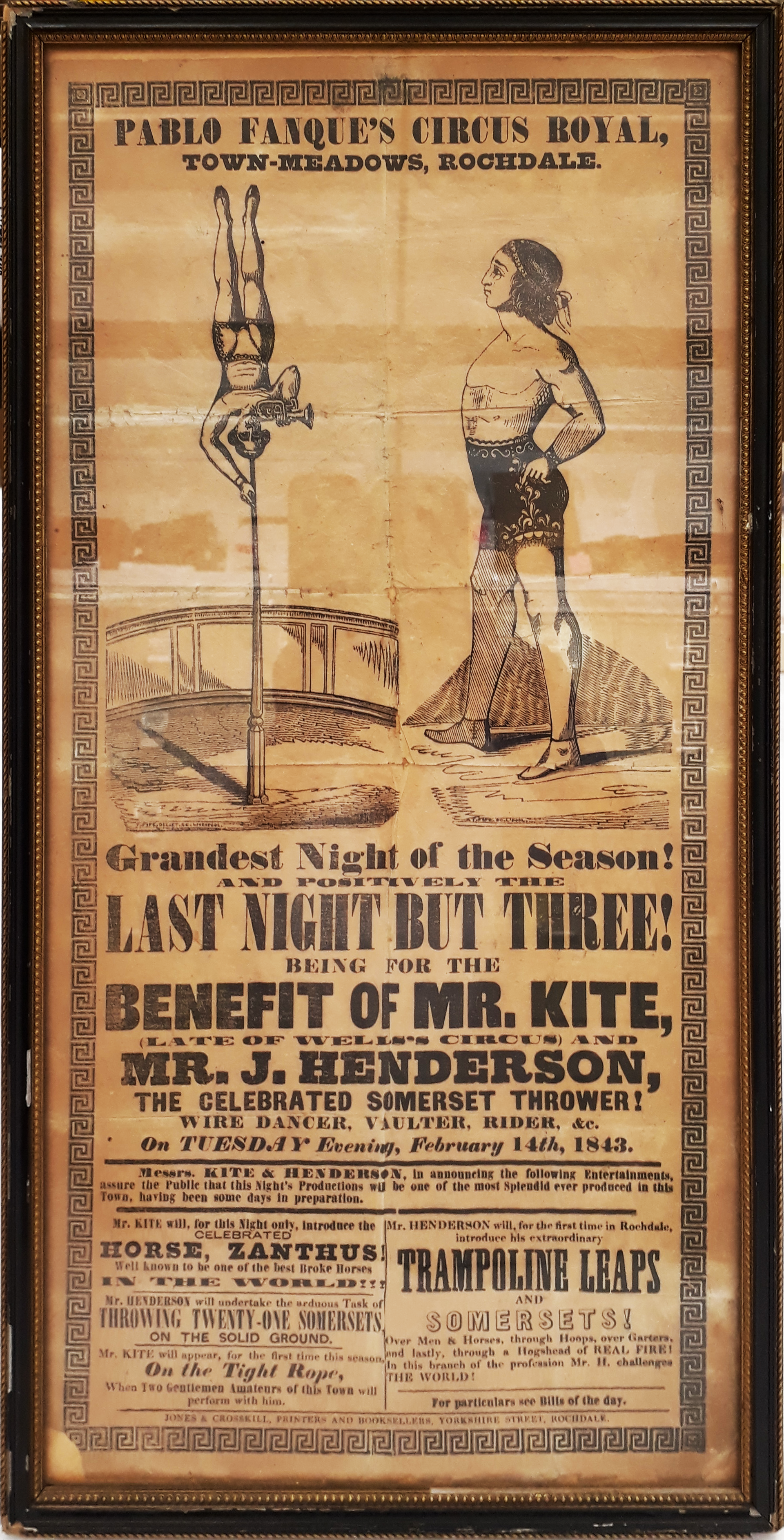
Historically, using lots of fonts, sizes and weights might have been a way of attracting attention – look at the 1843 poster which was the inspiration for John Lennon to write “Being for the Benefit of Mr Kite” as one example …
… but these days, simplicity and consistency is generally preferred.
For a fascinating diversion into modern history, check out Jock Kinnear and Margaret Calvert’s seminal work on the UK’s motorway signage. Most people wouldn’t give it a second thought, but carefully designing the font and the layout of the signs to be employed in the late 1950s was a central part of the rollout of the new motorway network.
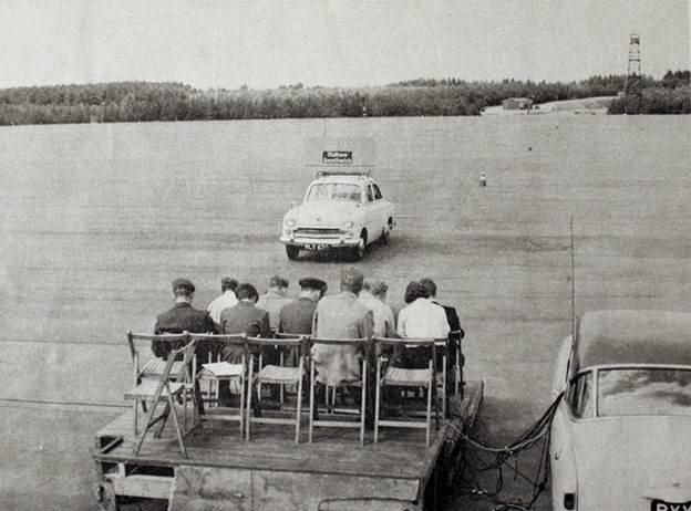
To test how legible signs might be at speed, an assembled group of volunteers sat on a platform at RAF Benson airfield while sample signs were driven past on the roof of a car. The thinking was that if you’re travelling as fast as 60mph, you won’t have time to read the words on a sign, instead relying on their shape – so the consistency of capitalization, the tail of the g and the stem of the h in Birmingham become second nature to the driver.
For more font-related history, check out Simon Garfield’s surprisingly engaging Just My Type.
Back to the present
Typeface trends tend to be a dating mechanism; Times New Roman looks very mid-1990s, whereas cool kids would use a sans serif default like Arial. Microsoft switched to using the newly designed Calibri for Office 2007, moving from a default font whose primary purpose was to look good in print to one which was specifically designed to be readable on screen. Similarly, the Segoe font family took a leading role as the default font for Microsoft logos and in the UI of many apps.
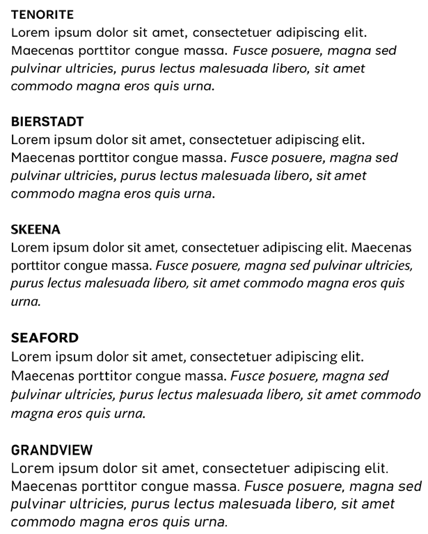
Incidentally, if you want to try a font out to see how it looks in a large block of text, you can enter =lorem(nnn) onto a new line in Word, and it will generate nnn paragraphs of the ‘lorem ipsum’ cod Latin gobbledygook to fill your pages up. Or you could go to Copilot or ChatGPT and ask it to write a 1,000 word essay for you…
Well, Calibri’s default-ness has been under threat for a few years – Microsoft announced its intent to switch and outlined several new fonts which might be the default. Last year, it announced the decision to switch Calibri to a newly-named font called Aptos, previously known as Bierstadt.
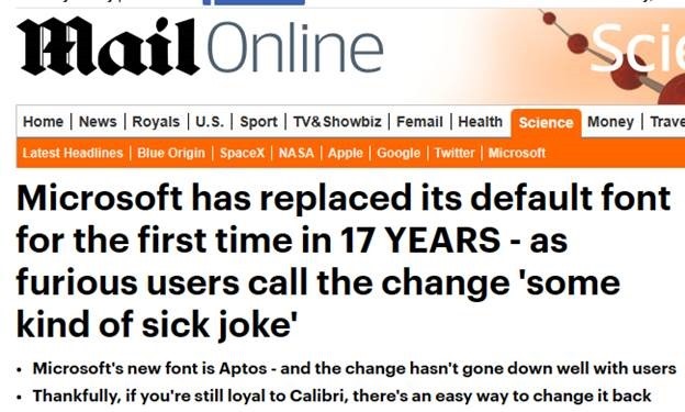
After a period of testing for preview customers, the switch has now been flicked and M365 users will see Aptos as their default. Cue some amusing anthropomorphism of the fonts’ particular characters and histrionic headlines from the usual clickbait foundries.


