
As the sun momentarily disappeared for many, strange things happened – like 50 year-old album-closing songs from moon-related LPs making into the iTunes charts, alongside that 80s power ballad about dove throwing.
You might think days like these don’t happen very often, but they’re probably more regular than you think, though often the path of totality is not over such a populous area as the latest eclipse. Book your Airbnb in Cornwall ready for the next total eclipse in only 66 years, or hang out in London for the one after that? Still, this time at least, we survived the Rapture.
For more moon-related shenanigans, do go and see The Moonwalkers in London before October 2024, and check out the ever-engaging The Rest is History duo interviewing Tom Hanks and shooting the breeze about the fascination with the Apollo lunar missions.
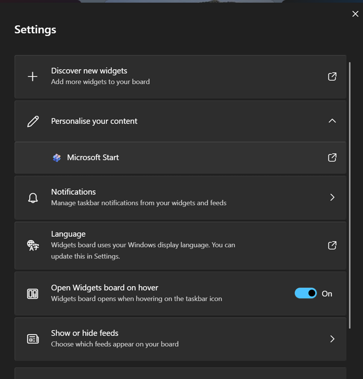
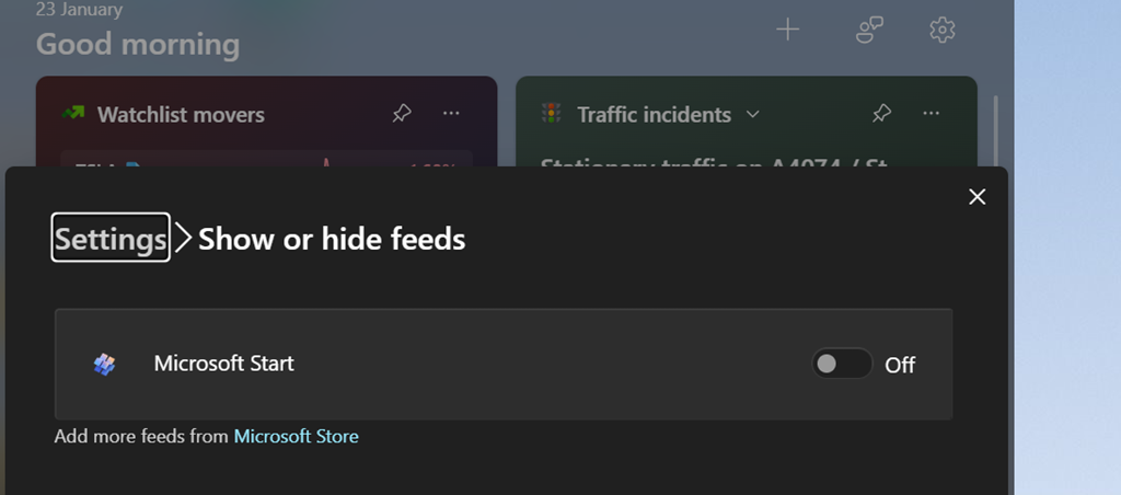
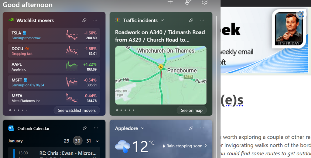
Back on terra firma, this past week saw Microsoft push out the latest stack of updates to Windows 11 which provide fixes to known issues as well as tweaks to the operating system, including the previously-discussed ability to remove the click-bait “news” stories from the Widgets board that may be visible on the lower left of the task bar or by pressing WindowsKey+W.

Windows 11 “Moment 5” (remember the days when Service Packs didn’t need to be all Saturday Night TV with their names?) has been available for a while if you sought it out. You should see it – masquerading as the less exciting KB5036893 – in Windows Update; if your PC says you’re up to date, you should see it under Update history…

As well enabling the switching off the stupid ads and AI-selected stories on the widgets board…

… you’ll get undreamt of delights like tabs in Notepad, snap layout suggestions, accessibility improvements and more reliable nearby sharing, as well as new AI powered stuff in Copilot for Windows and in the Photos app (with Generative Erase to cut things out of photos).
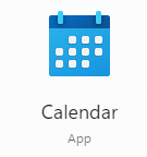 Take your average Calculator app; its form has changed little from the desktop calculator on which it’s based, or any Calendar application used for organizing appointments which still follows the idea of a planner or physical monthly calendar.
 How many people born in the 21st century have ever used a
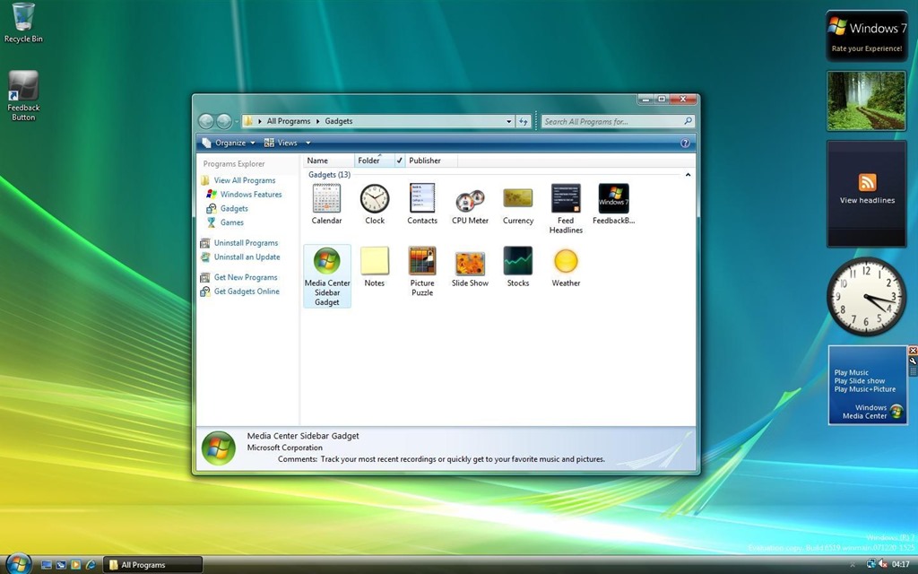


